
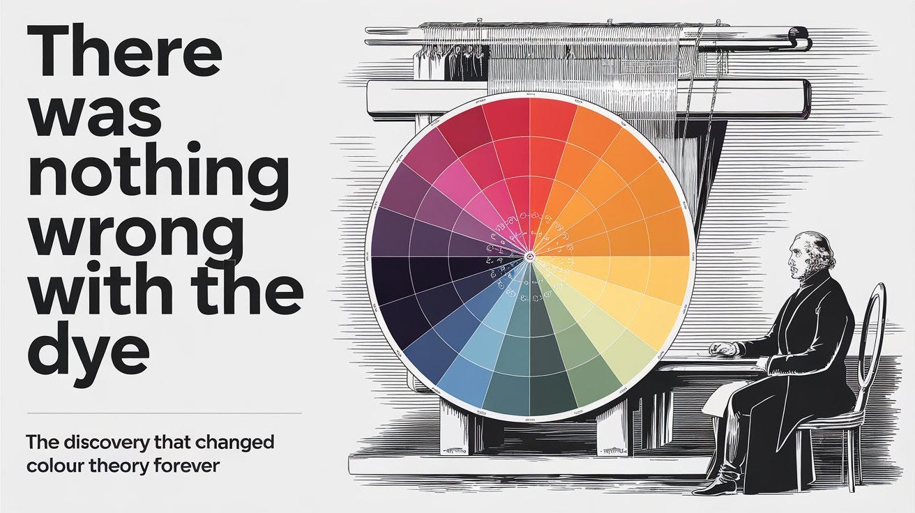
There Was Nothing Wrong With the Dye
In 1824, Michel Eugène Chevreul was hired to fix a colour problem at Paris’s most famous tapestry factory. The dye was perfect. The discovery he made instead changed visual art forever.

✦ Transparency note: This article was written by AI and reviewed by the author. All factual claims were independently verified (at least with another prompt) before publication. Mistakes may still happen.
Disclaimer: The information in this post is for educational and informational purposes only. It does not constitute financial, legal, or professional advice. The author is not liable for any financial loss or damages arising from use of this information. Data, pricing, and availability referenced here may be out of date — always verify independently before acting on it.
The complaint was straightforward: the black dye at the Gobelins Manufactory wasn’t working. 🧵
The Gobelins was not some ordinary workshop. Established in the 17th century under Louis XIV, it was the royal tapestry factory of France — the place where the most technically demanding textiles in Europe were produced. Weavers there spent years, sometimes decades, on a single tapestry. A colour problem was a serious matter.
Customers were returning pieces saying the black looked weak. Reddish. Dull. They blamed the dye.
In 1824, the factory’s directors appointed Michel Eugène Chevreul to solve it. Chevreul was France’s foremost chemist of organic compounds — already celebrated for his work on animal fats and soap manufacture. He was a rigorous, methodical scientist. He would test the dye, find the flaw, and fix it.
He tested the dye. There was no flaw. 😮
The Problem That Wasn’t a Chemistry Problem 🎨
The black dye at Gobelins was chemically excellent. Chevreul confirmed this. And yet — the customers were right. The black threads did look weak and reddish in the finished tapestries.
Chevreul looked more carefully. He noticed something that changed how he understood vision entirely.
The “weak” black only appeared weak in specific contexts. When it was woven next to deep blues and purples, it looked dull and reddish. When woven next to warm colours, it looked perfectly strong. The same dye, producing the same black thread, appeared as two completely different colours depending on what was beside it.
The problem was not in the dye. The problem was in the eye. 👁️
Chevreul had stumbled into something that no chemist had any reason to find and that artists had sensed for centuries without being able to name it: colours do not exist in isolation. Every colour you see is being actively modified by every colour surrounding it. Your brain is not a passive receiver of colour information — it is constantly comparing, contrasting, and adjusting, pushing each colour toward the complementary of its neighbour.
Black next to blue looks warm and reddish because blue’s complementary is orange, and your visual system shifts the black in that direction. It is not a trick. It is how vision works. 🔢
Fifteen Years of Investigation 📖
Chevreul spent the next fifteen years building a complete theory.
What began as a dye complaint became the most comprehensive study of colour perception ever written. His conclusion — that the apparent colour of any object is always relative to its surroundings — he called the law of simultaneous contrast. The more he looked, the more he found it operating everywhere: in paint, in fabric, in the colour of shadows, in the way the sky looks different at the horizon than at the zenith. 🌤️
In 1839 he published the result: De la loi du contraste simultané des couleurs et de l’assortiment des objets colorés — “On the Law of Simultaneous Contrast of Colours.”
It was not a short book. Chevreul was thorough. The volume covered applications to tapestries, carpets, furniture, mosaics, church windows, museum galleries, apartment interiors, formal gardens, theatre staging, typography, cartography, women’s clothing, and military uniforms. He was, essentially, writing the scientific foundation of design itself. 🏛️
Alongside the text he published his 72-colour chromatic circle — a wheel of primary and secondary hues in their purest forms, each gradated through nine degrees of darkness, printed using chromochalcography at the absolute limit of what printing technology in 1839 could manage. It is beautiful. It is also, unmistakably, the ancestor of every digital colour wheel in use today.
The Man Who Lived Long Enough to See His Own Legacy 🕰️
Chevreul is one of those figures whose biography becomes almost implausible at the edges.
He was born on 31 August 1786 — the year before the French Revolution. He died on 9 April 1889 — 102 years old. In that single lifetime he watched France go through revolution, empire, restoration, and republic. He saw the invention of the steam engine, the telegraph, the photograph, and the electric light. He saw chemistry transform from alchemy-adjacent craft into modern science. He helped cause the last of those himself. 😮
Among the 72 scientists and engineers whose names are inscribed on the Eiffel Tower, Chevreul is one of only two who were still alive when it was completed. The tower was topped on 31 March 1889. Chevreul died nine days later.
He saw his own name on the Eiffel Tower. ✨
By the 1880s — well into his nineties — Chevreul had turned his scientific attention to a new subject: the study of ageing itself. He observed and documented his own cognitive decline with the same methodical curiosity he had brought to animal fats and coloured thread. In 1886, on his 100th birthday, he sat for what is considered the world’s first photographically illustrated press interview — photographed by Paul Nadar for Le Journal illustré while his father Félix Nadar questioned him about colour theory, Louis Pasteur, and — naturally — how to live to 100.
The Royal Society awarded him the Copley Medal in 1857 — its highest honour — partly for his colour research. He was 70.
How the Artists Used It 🖌️
Chevreul did not set out to influence painting. He was a chemist solving an industrial problem. But De la loi du contraste simultané reached artists, and what they did with it was extraordinary.
The Impressionists were contemporaries of Chevreul’s work, but most weren’t working directly from his theory — their approach was more intuitive than systematic. They were painting the effect of light, not applying colour science. 🌅
But a younger generation saw the theory and took it literally.
In the early 1880s, Georges Seurat — a young painter in Paris — read Chevreul alongside the physicist Ogden Rood’s Modern Chromatics (1879) and began developing something new. If simultaneous contrast was a law of perception, you could use it as a technique. Place tiny dots of pure colour next to each other instead of mixing them on the palette. Let the mixing happen in the viewer’s eye — on the retina itself — the way Chevreul’s theory said it would. The resulting luminosity would be greater than any pigment blend could achieve. 💡
The result was A Sunday on La Grande Jatte, painted 1884–1886, and the birth of Pointillism (which Seurat himself called Divisionism — division of colour rather than blending of it). Every dot in that painting is an application of Chevreul’s law. The colour you perceive when you stand back from it is not on the canvas. It is assembled in your brain, exactly as Chevreul described. 🎨
Seurat died at 31, in 1891, leaving a small but technically revolutionary body of work. His collaborator Paul Signac continued developing Divisionism and wrote its definitive manual, D’Eugène Delacroix au néo-impressionnisme (1899), which carried Chevreul’s influence into the 20th century — directly into the hands of Matisse and the Fauves, and through them into virtually everything that came after. 🌈
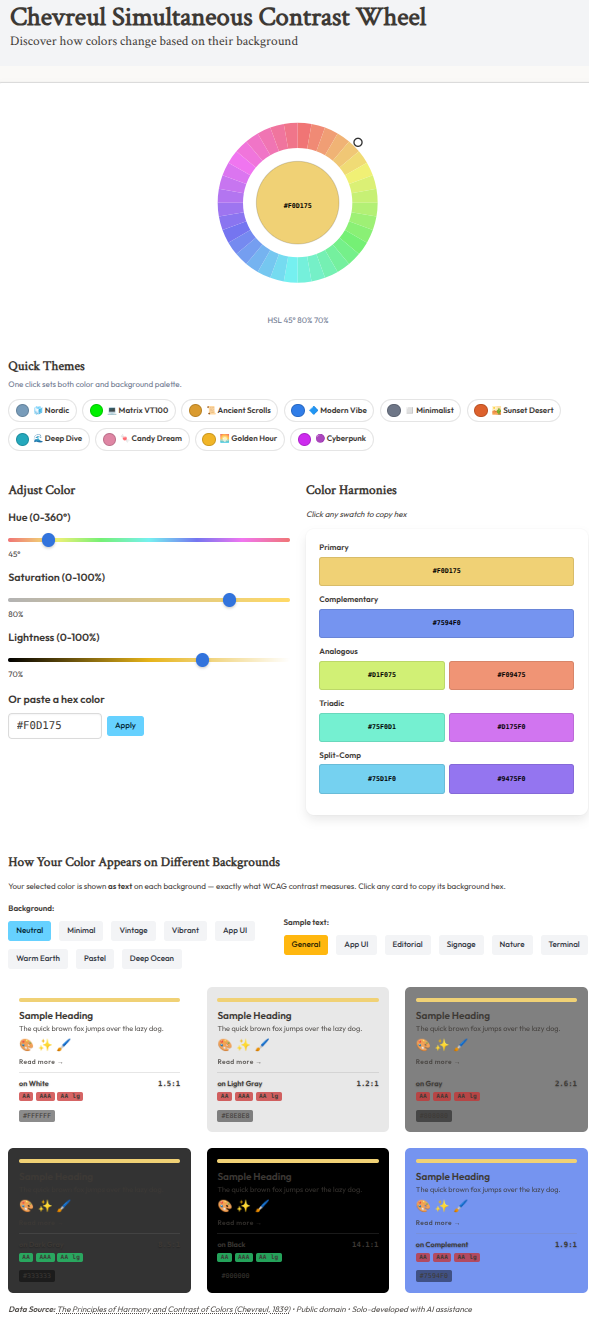
The Tool: Chevreul Simultaneous Contrast Wheel 🖥️

This is the law of simultaneous contrast made interactive — and extended all the way into modern accessibility standards.
Colour Input
SVG arc wheel — a smooth donut ring of 36 arc segments at their true hues; a glowing indicator dot rotates around the ring as you drag 🎡
Hue / Saturation / Lightness sliders — tracks update live: hue shows the actual spectrum, saturation fades from grey to full chroma, lightness fades black → colour → white
Hex input — paste any brand or web hex directly (e.g.
#3B82F6) and the wheel and sliders sync instantly 📋
Harmonies Panel — 8 groups 🎨
Primary, Complementary, Analogous ×2, Triadic ×2, Split-Complementary ×2. Every swatch is clickable to copy its hex code.
Contrast & Accessibility Cards ♿
This is where Chevreul meets modern design practice. Your selected colour appears as actual readable text on each background card — heading, body paragraph, emoji row, CTA link — not as an abstract swatch. Each card shows:
Live WCAG 2.1 contrast ratio (e.g.
7.2:1) 📊Pass/fail badges for AA, AAA, and AA large text
AA threshold: 4.5:1 normal / 3:1 large; AAA: 7:1 normal / 4.5:1 large
The ratio is no longer a number to look up in a spec — it’s a piece of text you can read, or can’t.
Presets
8 background palettes — Neutral, Minimalistic, Vintage, Vibrant, App UI, Warm Earth, Pastel, Deep Ocean
6 text sample presets — General, App UI, Editorial, Signage, Nature, Terminal
10 one-click combo themes — sets foreground colour + background palette + text sample simultaneously:
🧊 Nordic · 💻 Matrix VT100 · 📜 Ancient Scrolls · 🔷 Modern Vibe · ◻️ Minimalist · 🏜️ Sunset Desert · 🌊 Deep Dive · 🍬 Candy Dream · 🌅 Golden Hour · 🟣 Cyberpunk
The same hex value, displayed across eight different background palettes, looking visibly different in every one. That is Chevreul’s discovery — not as theory but as a thing you can see right now, in your browser. 😮
Using the Tool in Practice 🎯
Chevreul’s law has direct, practical consequences for anyone working with colour — and the tool extends it all the way to modern web accessibility standards.
For designers: The colour that looks right in isolation will not necessarily look right in context. The harmonies panel gives you eight colour relationship types instantly — complementary, triadic, split-complementary — and the WCAG contrast cards show exactly how your primary colour behaves as real text on real backgrounds. 🖥️
For developers and accessibility testers: The WCAG 2.1 badges are the fastest compliance check available. Paste your hex, switch backgrounds, read the AA/AAA indicators — no manual ratio calculation. If it passes, ship it. If it fails, try an analogous hue with better lightness contrast. ♿
For painters: This is why mixing a shadow colour isn’t as simple as adding black to the base. Shadows inherit the complementary of the light hitting them. A shadow on yellow skin in warm light will have a cool violet cast — not because there is violet in the shadow, but because your eye is comparing it to the yellow and compensating. Chevreul quantified what painters had been observing and ignoring for centuries. 🎭
For knitters, weavers, embroiderers: Yarn and thread colours interact exactly the way Chevreul found at Gobelins. A colour you chose from a skein on its own will look different once it’s woven next to other colours. The wheel lets you check the interaction before you commit. 🧶
For non-designers who just need a starting point: Hit one of the 10 quick combo themes. Each one sets foreground colour, background palette, and text sample simultaneously — vetted, pre-tested combinations with real contrast scores. Start from Nordic or Minimalist and adjust from there. 🎯
Step-by-Step: Read Your Colours in Context 📋
Step 1 — Enter your colour 🎨
Open the Chevreul Simultaneous Contrast Wheel. If you have a hex code — a brand colour, a web colour, anything — paste it directly into the hex input field. The arc wheel and all three sliders update instantly. If you’re exploring rather than matching, drag the hue indicator dot around the SVG ring and watch the gradient tracks update live as it turns.
Step 2 — Read the harmonies 🎡
The harmonies panel shows eight colour relationship groups: Primary, Complementary, Analogous ×2, Triadic ×2, Split-Complementary ×2. Click any swatch to copy its hex. Before you decide anything, look at what lives around your colour on the wheel. The complementary is the colour that will most powerfully shift your chosen colour when placed adjacent — the relationship Chevreul found in the Gobelins thread.
Step 3 — Check the WCAG contrast cards 👁️
This is the practical heart of the tool. Your selected colour appears as actual text on each background card — heading, body paragraph, emoji row, CTA link. Look at the ratio and the pass/fail badges: AA, AAA, AA large text.
Ask: Does the text feel readable, or are you squinting? Does the badge match what your eyes are already telling you? If they disagree, that’s Chevreul’s law — context is distorting your perception of contrast. Trust the ratio. ♿
Step 4 — Switch palettes and text presets ⚡
Try a different background palette: swap Neutral for Deep Ocean, or Vibrant for Pastel. Watch the WCAG ratios change as background lightness shifts. Then switch the text sample preset — General to Terminal, Editorial to App UI — to see your colour in the actual copy it will be used in. A colour that passes for a headline may fail for body text on the same background. 🌈
Step 5 — Try a quick combo theme 🎨
Starting from scratch rather than matching a brand colour? Hit one of the 10 quick themes. Each one selects a foreground colour, background palette, and text sample simultaneously. Matrix VT100 for terminal aesthetics. Ancient Scrolls for editorial warmth. Nordic for clean UI. These are tested starting points with real contrast scores — adjust from there once you have a foundation.
Step 6 — Build and verify your full palette 🖌️
For each supporting colour in your scheme — triadic accent, analogous secondary — go back through the WCAG cards and check every combination that will actually appear together. Do this before printing, weaving, painting, or shipping. Chevreul spent fifteen years on this problem so you don’t have to. 😌
🐾 A Chromatic Field Report from the Bureau of Contextual Perception
Institute of Feline Visual Science · Riatto Lab
mrrp. 😼
the human left the colour wheel open on the screen. i sat in front of it and stared for several minutes. 👁️👁️
i have done some research. cats, it turns out, have dichromatic vision. we see blues and yellows. we are largely indifferent to red. the human finds this sad. i find this efficient.
the colour wheel had a lot of red in it. 😾 i moved on.
the human explained chevreul’s law. i understood it immediately. i have known for years that the grey blanket looks different on the white sofa versus the dark wooden floor. i did not know there was a law about it. i assumed it was simply an aspect of the universe i had personally noticed and others had not. 😹
i sat on the neutral grey background swatch. i then sat on the complementary colour swatch. the human said i was interfering with the demonstration. i was being the demonstration. 🐱
i have reviewed chevreul’s qualifications. chemist. soap expert. lived to 102. i also have excellent longevity prospects and strong opinions about texture. the parallels continue.
i note that his name is on the eiffel tower. i have not been to paris. however, i have sat on many flat surfaces of increasing altitude and i believe the principle is the same.
my assessment of the tool: the six context swatches are exactly right. perception is context. i know this from sitting in patches of sunlight and watching humans assume i am warm when i am actually conducting optical surveillance. 🔬
— Hue
Director of Dichromatic Affairs, Bureau of Contextual Perception, Institute of Feline Visual Science
“the colour is whatever i say it is.” 🐾
Try It
Free to use. No sign-up required. Complementary, analogous, and six simultaneous contrast backgrounds included.
Working on a colour project — design, painting, textile, or photography? Try the contrast wheel and tell us the most surprising shift you found — comments open below. 👇
Affiliate disclosure: This post contains Amazon affiliate links. I may earn a small commission at no extra cost to you.
References
Michel Eugène Chevreul (1786–1889) — appointed director of dye works at Gobelins 1824 — Britannica: Michel-Eugène Chevreul; Linda Hall Library: Michel Chevreul
De la loi du contraste simultané des couleurs (1839), Pitois-Levrault, Paris — Internet Archive: full text (public domain); Peter Harrington: first edition description
72-colour chromatic circle, 1839 — Royal Academy of Arts Collection (public domain)
Copley Medal 1857 — Royal Society Colour Wheel article
Nadar photographic interview (1886) — world’s first photographically illustrated press interview — History of Information: Le Journal Illustré first photo-interview
Chevreul’s name on the Eiffel Tower, alive at its completion 31 March 1889, died 9 April 1889 — Wikipedia: Michel Eugène Chevreul (public domain)
Seurat, A Sunday on La Grande Jatte (1884–1886), Pointillism/Divisionism, Chevreul influence — Wikipedia: A Sunday Afternoon on the Island of La Grande Jatte (public domain); WebExhibits: Pointillism and the Grande Jatte
Paul Signac, D’Eugène Delacroix au néo-impressionnisme (1899) — primary source, public domain
Riatto Lab: Chevreul Simultaneous Contrast Wheel
About this article
This post was written by AI and reviewed by the author. All factual claims were verified (with another prompt) at the time of publication. Final perspective, editorial judgement, and any opinions expressed are the author’s own.Published on riatto.substack.com · March 2026